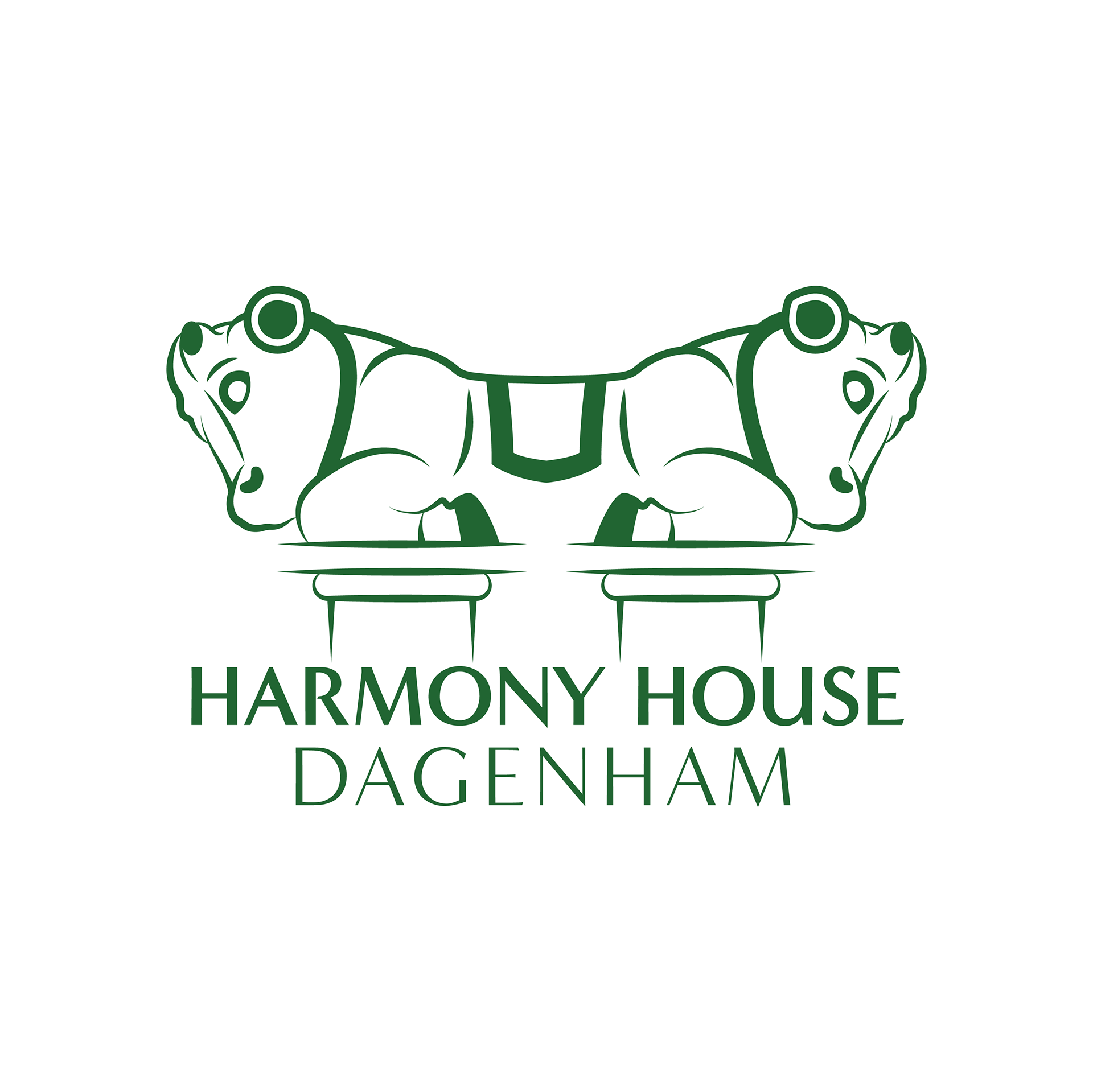
Harmony House, a Community Interest Company, asked me to design them a new logo. The double headed bull in the logo is derived from the stone guardians which sit atop pillars at the company's headquarters. We knew from the start that something as unique as this had to be represented in the logo!
Other than including the bull, the brief specified something ornate and elegant, yet clean and modern.

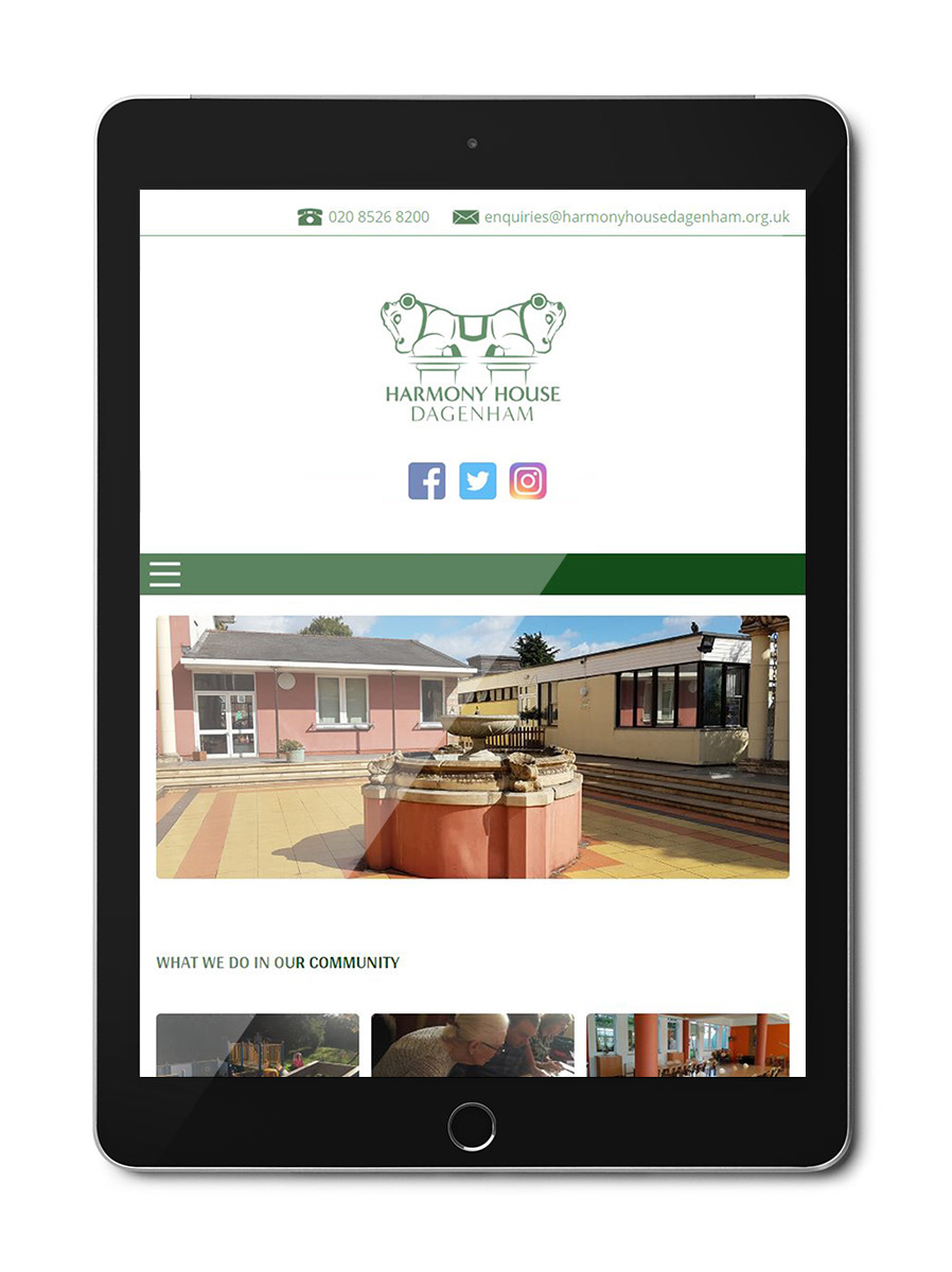
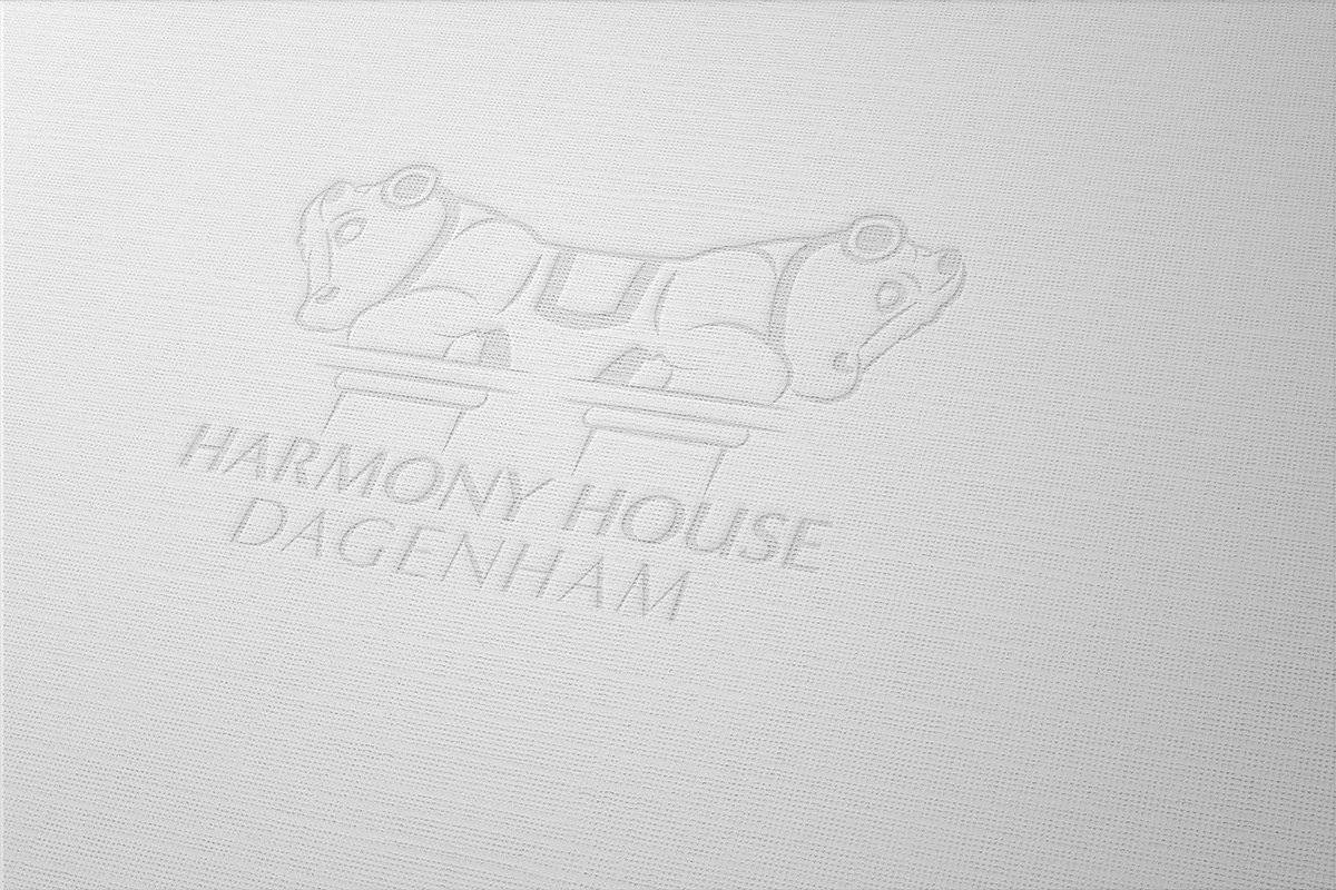
The logo on the Harmony House Dagenham website
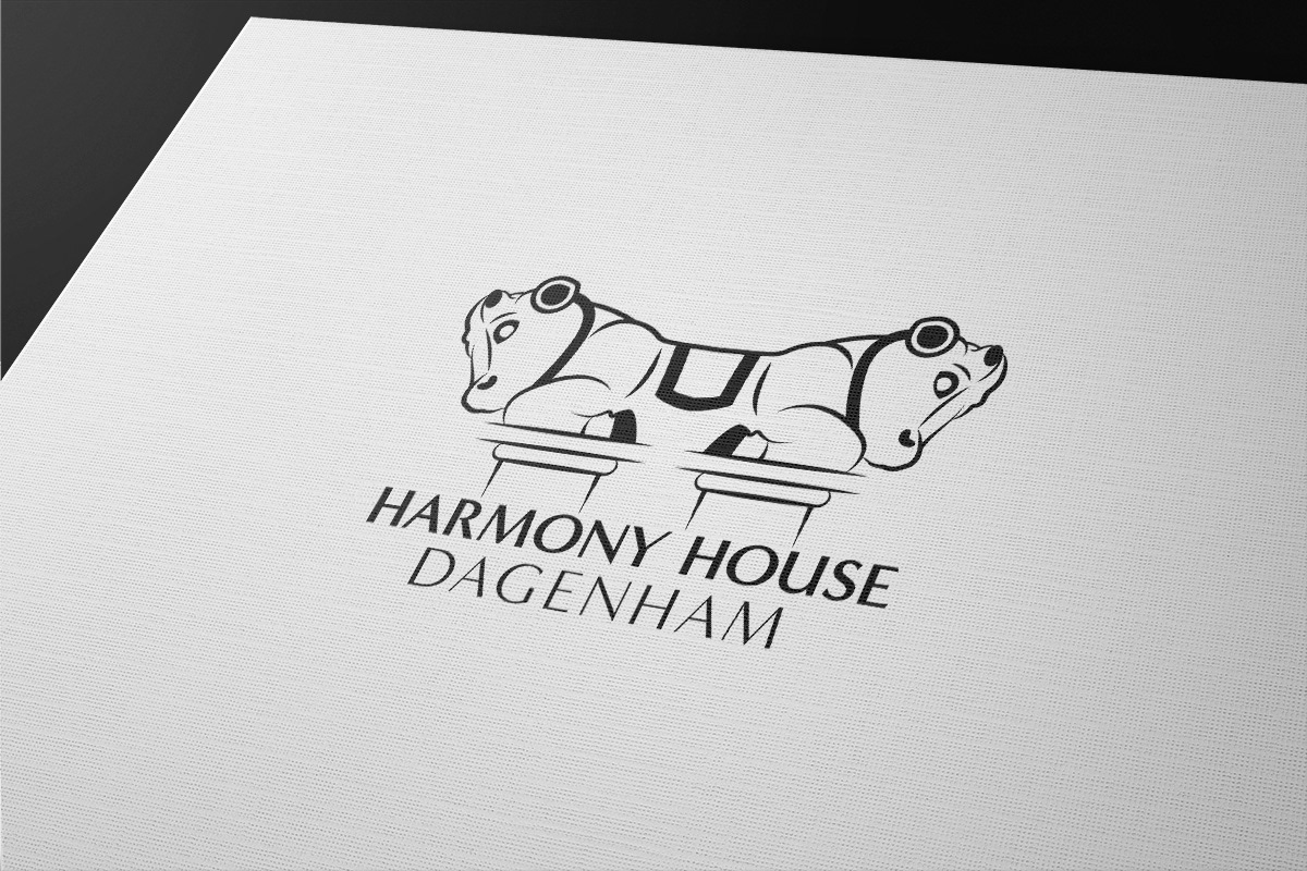
Mockup created to give an impression of the logo in potential printed use
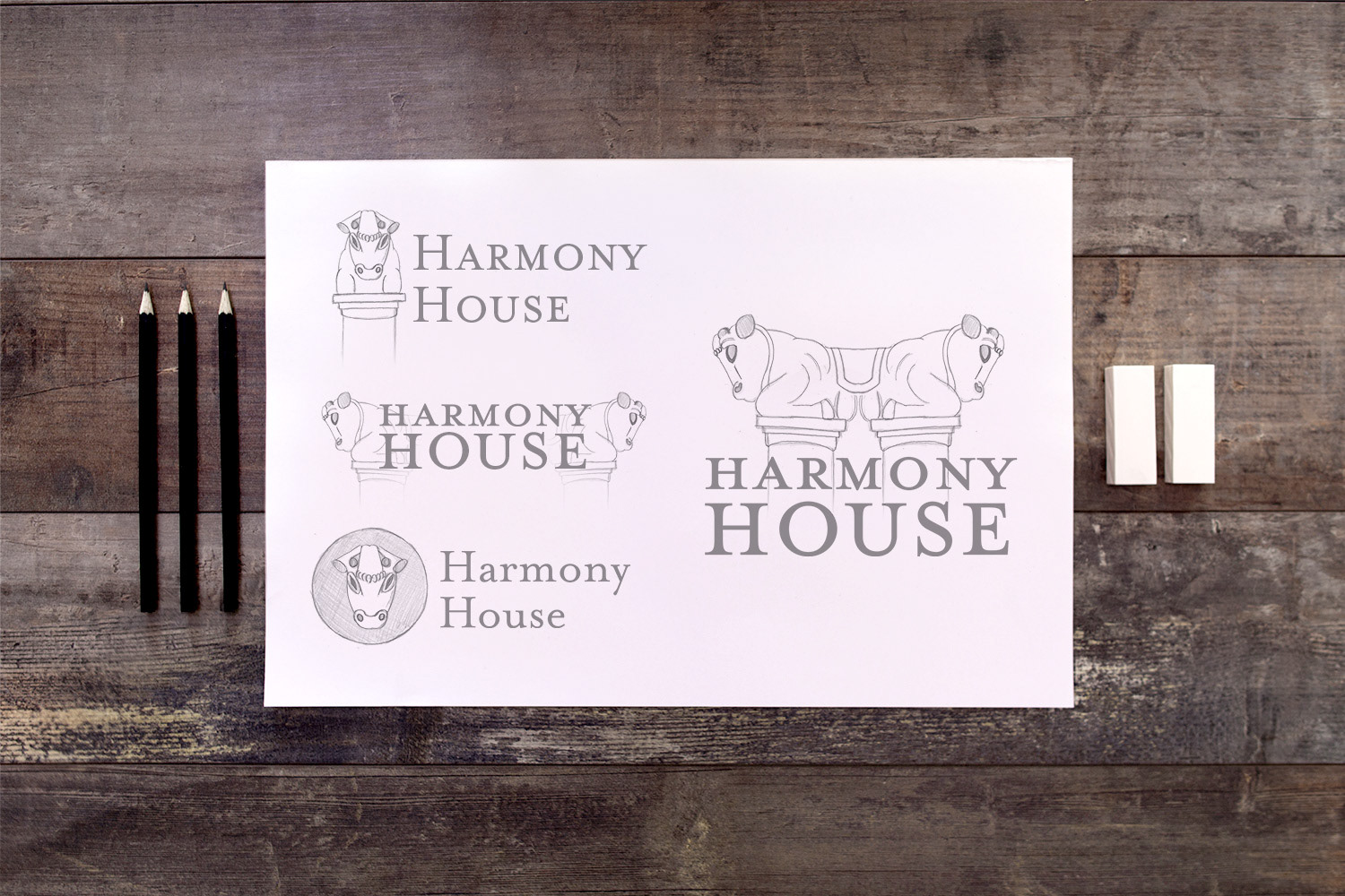
Logo development process with variations
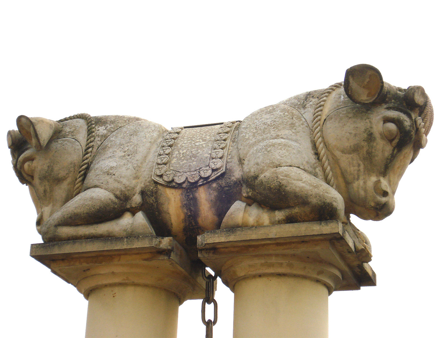
The famous double-headed bull!